Customising your chat widget's look
Position, size, colour and the launcher message — how each appearance setting works and what actually affects engagement.
2 min readUpdated 2026-09-02
The widget should look like part of your site, not a bolt-on. Appearance settings live in your dashboard and apply live — no re-embedding, no cache to clear on Chaaty's side.
The appearance screen
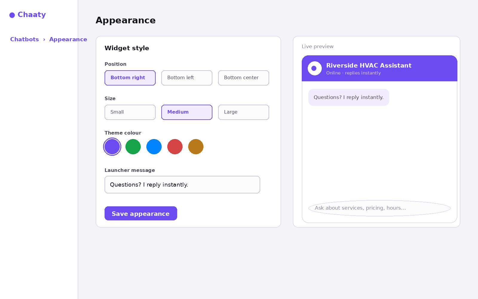
- Position — bottom-right is the convention visitors expect; bottom-left suits sites whose right corner is occupied (cookie banners, back-to-top buttons).
- Size — medium fits most sites. Large works on content-heavy pages where chat is a primary action; small suits minimal designs.
- Theme colour — used for the launcher, header and your visitor's message bubbles. Pick your brand's primary; the widget derives the rest.
- Launcher message — the short line that appears near the closed launcher. Specific beats generic: "Questions about pricing? I reply instantly" outperforms "Chat with us".
What actually moves engagement
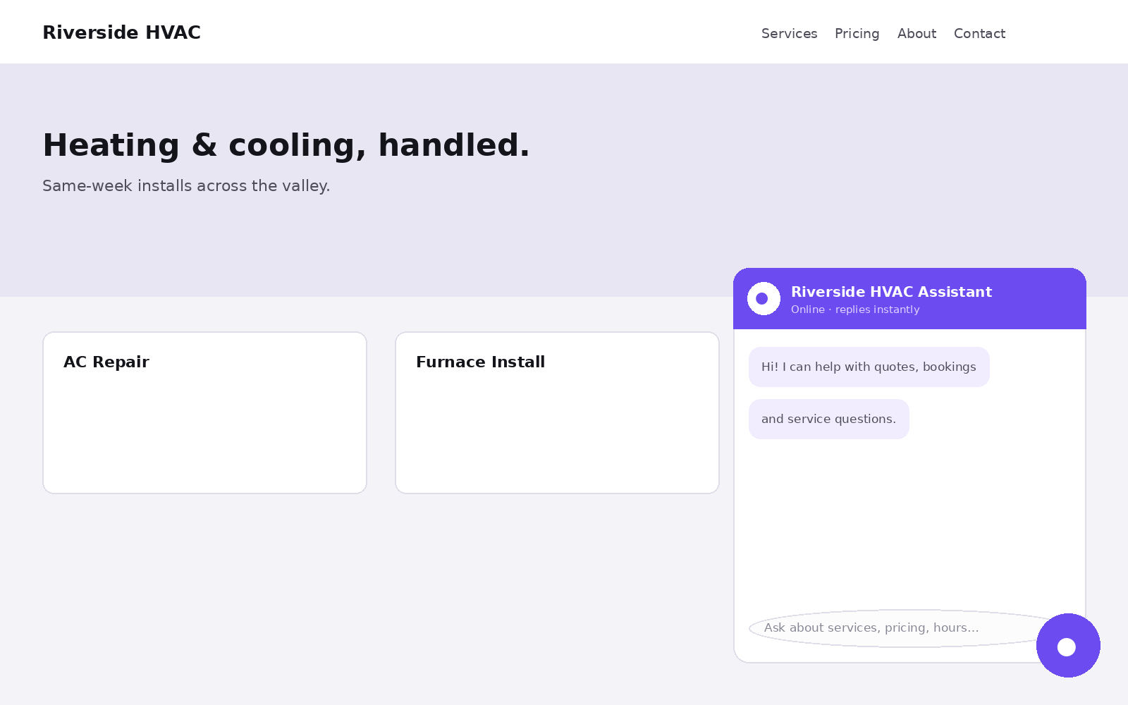
Colour and size are taste; two settings measurably matter. The launcher message, because it's the widget's headline — write it like one. And the greeting, the first message in an opened chat, which is set with your assistant's other content in training.
Try this on your own assistant
Chaaty is free to start — your assistant is built from your website in about a minute.